
-
Château Cartier Resort , Aylmer, Quebec
Marcio Melo
May 22 mai - September 7 septembre, 1998
![]()
1170 chemin Aylmer, Aylmer, Quebec, Canada 819-777-1088
The Creative Process
"Drama" is a theme for a show that I've had in mind for several years. This winter I was approached by the Château Cartier to exhibit under their new program of promoting emerging local artists. After viewing the rich classic elegance of the exhibition space, and given complete artistic freedom in my works, I had a venue for my ideas that I had formed. While often relating to the stage, drama is also defined in the dictionary as a striking or vivid quality or effect. I projected this definition of the word into my paintings, from the choice of themes to the creation of the frames, in order to achieve an atmosphere of rich intensity. "Drama" is an autobiographical show that plays with different ideas ranging from ordinary daily life to a more profound and personal symbolism. It is a celebration of life and painting through inner visionformed over the years. For "Drama", I have created nineteen paintings in acrylic on canvas. Their large size (sixteen are 76 cm by 101 cm (30" by 40") and three are 101 cm by 152 cm (40" by 60")) suits the location. Each painting is finished with my trademark frames, textured and painted to complement the work.
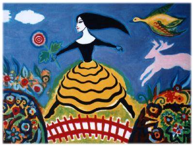
Le printemps (Spring)
Last year I saw an exhibition at the Museum of Civilization about Nova Scotia artist Maude Lewis. I remember spending several hours admiring her sense of colour, the simplicity of her work and the positive message that it communicated. This painting is based on one that I did on paper at the time, inspired by her work. This same imagery was used recently in a collaboration mural with artists Marie-France Nitski and Liz Minnes celebrating the Ottawa Tulip Festival located at the corner of Rideau and MacKenzie streets.

Musa Modigliana
As a child I spent countless hours drawing female figures. I took real pleasure drawing eyes, eyelashes, eyebrows lips and hair. I would have been happy drawing for fashion magazines had that been my destiny. The day before I started this painting, I spent some time appreciating the figurative precision of the Portuguese painter Paula Rego in a book I'd borrowed from the library. After I left this book, I looked through another containing paintings of the Italian Modigliani, whose works I deeply admire. These two influences combined with my love for the paintings of Brazilian mulatto ladies were the forces behind this creation. To me painting is not a matter of proving to yourself what you can do, but rather doing what can be done. I have to allow certain accidents to occur, which allows me to create something new. The girl in the painting could be either Brazilian or Italian; the composition does not show any cultural elements except for the vaguely abstract background that at times makes me think of a Bossa Nova record cover by Stan Getz and Joao Gilberto.
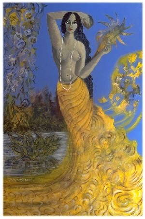
Our Lady of the Fresh Waters
As opposed to the Catholic saints which are highly represented in art through painting and sculpture, there are few honouring the saints of the Brazilian Candomblé religion (an African based religion which worships the forces of nature, such as oceans, rivers, forests and plants). One exception is Iemanja, the goddess of the sea - reigning the oceans, popular art depicts her as a sensual lady dressed in a long blue dress, hands stretched out. As far as I know she is portrayed by all artisans in the same recognizable manner.
Queen of fresh waters and fertility, Oxum is vain and a seductress. She is delicate like the whispering of a stream, powerful like the waterfall... Women wishing to conceive pray to her.
In 1992, I worked on a series of these Brazilian saints using fingerpaints on paper for an outdoor exhibition that was canceled due to rain. One of them was Oxum, the goddess of the fresh waters. She bore an unconscious resemblance to one of Michaelangelo's statues; the way she had her arm lifted behind her head. This painting of her is based on the first one, except its style is closer to the popular representation of Iemanja. Oxum is known to be extremely vain; she holds a gold, jewel encrusted metal fan with a mirror. Her colours are yellow, white and gold.
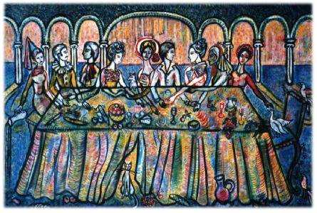
À la table (At the Table)
This painting is the result of the combination of two previous similar ones done in different media (watercolour on paper and acrylic on mirror). The watercolour originated the idea. By drawing the outline of the table first, and then the people, a transparent effect was created. It was only later that I became aware that this situation could be interpreted in two different ways. It is not clear whether people's hands could be under or on top of the table. In the second version I took advantage of this effect, working on a found mirror in Pisa, Italy. The use of columns and arches in the background were taken from the local architecture. My experience at the Italian dinner table accounts for the spontaneous and natural disorder, the dog and the duck.
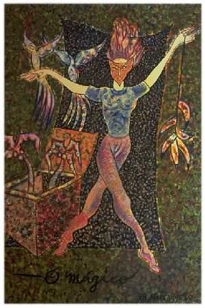
Le magicien (The Magician)
This painting is based on a watercolour and ink drawing made in 1991. I made it before my first show and echoes a time in Brazil when my drawings were inspired by dancers. It stood out from the rest of a series for some special reason. Because the original was done on non-archival paper, I had only distributed reproductions, which were very popular. This is my homage to that magician, a permanent, large sized original. Stretching arms, neither standing or moving, the magician with legs going in different directions communicates a strange sense of balance. The curtain behind him hides, while the box reveals the elements of his magic.
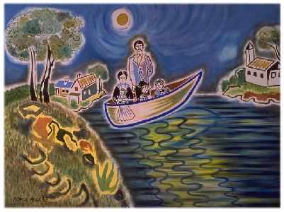
The Watsons
In the Northeast of Brazil, lives a wood cut artist called Amaro Francisco. He is known for his simple compositions depicting popular scenes. He uses bright solid blocks of colours and black, printed on a pure white background. Each image is restricted to its maximum simplicity, resulting in the final work that looks like a puzzle of areas pulled together. This way of working allows the artist to develop an idea without having to know what he is going to do next, like building a wall with colourful rocks of different sizes and shapes. When I started doing watercolours, I wanted to simplify things. I was impatient waiting for a wash to dry so that it could be worked over again. I wanted to continue without interruption or a defined direction. This block print solution would let me accomplish this. This painting is a transposition of this style to acrylic on canvas. One day my friend Ted showed me an old photograph of his family. On the back of it was written George Watson and Family. It's one of those pictures of the past where everyone is posed for a single shot. The father standing up, the mother sitting with her children, one of them a baby. I loved the long baptism clothes, so long they would touch the ground. I decided I wanted to do a painting of it but still did not know how to approach it. One day I sat down with my watercolours with the photo near me and started drawing all the members of the family. I started in the centre of the paper with the father, followed by the mother, followed by the baby and his siblings. I don't really remember when or why I decided to place them in a boat in the water. Maybe because it has that same timeless feeling that I found in the photograph. It contains and keeps them together in the centre of the scene without telling us if they are coming or going, arriving or departing, suspended in time. The full moon behind them reflects precisely four rays of light to the foreground of the picture as if to represent symbolically their lifelines and destinies. The mother and the baby are placed in one single line.
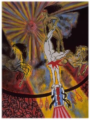
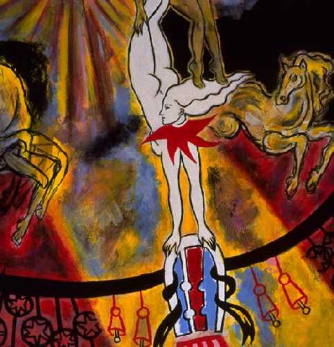
Força e Equilibrio (Strength and Balance)
Even though the circus was an obvious source of inspiration for this painting, its meaning is more symbolic than based on reality. The title was the result of my reflections after its conclusion. Strength, for the main performer seems to be made of alabaster, and serves as a stand for the top one. Balance, because they integrate by being made of different natures and standing in opposite directions.
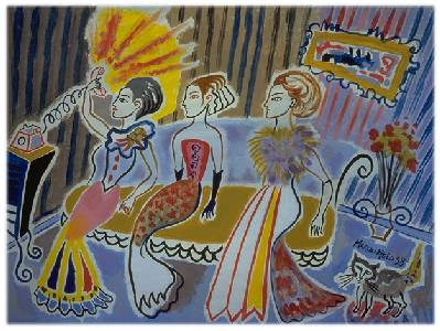
The Telephone
This painting was originally done as a watercolour painting on paper. As a rule, watercolour works best for me when simplified to its basic detail. This process requires precision and concentration, having to change brushes and colours for each of the areas that form the final composition. As a technique, this allows me to be guided by the painting without knowing where it is taking me. This creates interesting effects unanticipated when the painting was started. It was an almost incidental act that made me lift up the arm of the third lady on the sofa (an act that lacked the concentration stated above). I realized that she needed to hold something. "A telephone!", I thought, would pull all the parts of the picture together, giving it an anecdotal sense.
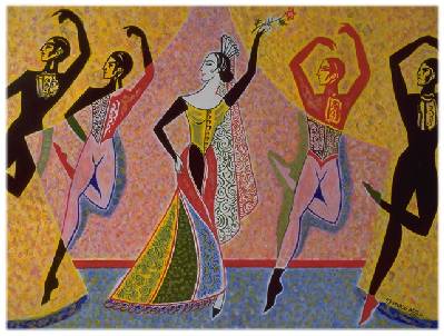
The Red of the Rose
The Red of the Rose is neither a painting about dancing, nor about Spain. It's more a symbol that I borrowed from that culture to express this uplifting feeling of passion and enthusiasm. It could have been expressed in a variety of painting forms, but given my nature, it's done in a figurative style. The magic of this painting lies in the way the dancers cross the horizontal space in a carefully calculated manner. It's a work originally done in watercolour and born from a colour concept. Red or green turning black, then turning into colour again. It's a static homage to transition and its beauty.
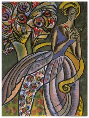
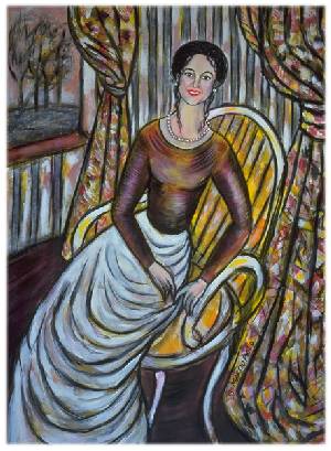
A Single Flower
When Drama was just a word and rested undeveloped in the depths of my mind, I would often have visions of pictures where contrast would play a major role in the composition of the paintings. The particular and the total of an idea. The seed that is planted and the consequent tree. Being the first painting of this series that I painted, it is interesting to observe how this principle was reflected in it. The way the sitting lady gazes at her flower as if to decipher its mystery can only be a metaphor to what lay ahead of me and had to be done in order to achieve my goal, which was going from one painting to the completed exhibition, just like the single flower she holds and the complete bouquet behind her. As an artist, I do believe in the strangely revealing nature of painting and its potential as an instrument for self development and growth.
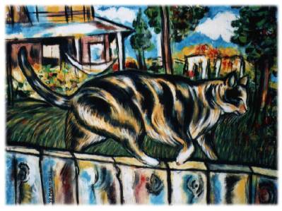
Walking on a Thin Line
On the farm where I live amongst diverse creatures, one of them stands out for being the object of my affection. Last summer I came across a picture of Katie (the cat) walking along the fence on a beautiful blue day. I loved the picture for its representational and symbolic values. The way she occupied the centre of the space in a gigantic manner giving proof of a wonderful sense of balance, set me forth to paint it.
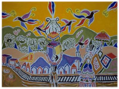
Na linha do trem (On the Train Tracks)
For last year's Pontiac Artists' Studio Tour, my artist's statement read, "Painting is like walking blindfolded over an uncertain line, trying altogether to see the colour, to keep balance and to find light". This statement deeply reflects the creative process behind this painting which was built step by step in a succession of individual strokes. Each of these strokes filled a bidimensional space and gave psychological meaning to the image as it progressed. It was a process full of surprises. At one point, what was supposed to be a ladder (lying between the boy and the lady) became the tracks of a train. Later in the process, the bird coming out of a chimney (on the right side of the painting) provides the solution for the top part of the picture. He is multiplied and now flies out of the cage into new different horizons.
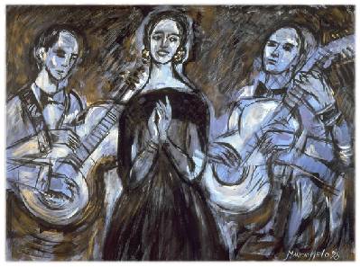
Fado Azul (Blue Fado)
Music is a common source of inspiration for me, not only the immediate pleasure of listening to it while painting but also its visual elements; the stage, the musicians and their instruments. If there is a musical genre to be portrayed in this exhibition, it had to be Fado. The urban music of Portugal is a symbol of authentic dramatic nature, painful solitude and ardent desire. Given the stillness and symmetry of this composition, I felt inclined to add multiple arms to the musicians in order to create a sensation of movement. I had used a similar solution in a picture with multiple passing faces and was pleased by the result.
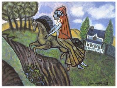
L'équestrienne (The Equestrian)
While looking through a book of illustrations at the library, I was taken by a beautiful illustration by Kay Nielsen (Illustration to Minon-Minette from In Powder and Crinoline - Old Fairy Tales 1913). Later, I came across a few historical paintings of the same theme, which inspired me to paint an equestrian figure. A few days passed until I had to face the white canvas for this painting. Even though I had this clear inspiration in mind from the beginning, this picture started in a very abstract manner. We all have the ability to make interpretations of abstract forms. At one point the background of the picture reminded me of a landscape, more precisely, an abyss. After a period of struggle, I made the decision to place a lady riding a horse on the right side of the canvas. Paintings are sometimes a series of individual sections. After having defined this composition, I observed that she was too far to the right. Like Kay Nielsen's, I wanted a figure that would dominate the centre of the composition, creating the impact that I intended. I liked her blue face and torso, in fact, at one point I thought the picture would be mainly blue and green. It was just at the very end that I took the risk to add the red veil to the lady. As a result, the red gave the picture a focal point without disturbing the rest of the composition.

Studio with Piano and Mandolin
In 1994 I had an exhibition at the Jacar Gallery with a series of works on paper depicting scenes involved with water entitled "Aquatica". They were drawings using a limited palette of blue and yellow tones outlined in black. These were developed in a time when I felt a strong urge to draw rather than to paint. The inspiration for this piece can be traced back to a trip I made to Montreal, during the Jazz Festival. The whole city was taken over by musical instruments. I came home impregnated by the beauty of their lines and forms. I started a series of paintings to send to Germany, where this "Aquatica" style is appreciated, and did several using these musical motifs. Germany is a land of great classical composers, and this gave me inspiration for my paintings' composition. "Studio with Piano and Mandolin" was done four years after "Aquatica", using the inspiration for the German paintings. It captures the same characteristics as the Aquatica series, except it has a much more colourful palette, and was painted using acrylic on canvas instead of watercolour and crayon conté on paper.
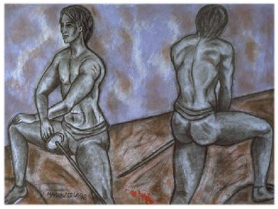
The Duellists
This image involved using two different models for the same composition. I had been attending a life drawing workshop, and had many sketched images that I liked. The idea came to me as a need to incorporate these life drawing efforts into a final painting. It's interesting to observe how painting in its process of realization can turn things around, giving them unexpected significance. What started as a direct transposition of two different drawings into the same space, became more like two sides of the same person. Beyond its apparent superficiality, painting is really dealing with more profound feelings, like our need for a balanced world even if the roots for this balance lies in conflict.
Musa Maria
The use of female figures in my paintings have both symbolic and historical meanings. Symbolic in the sense that they don't portray any particular person; historical because I enjoy making paintings that reflects a nostalgic feeling for the classic beauty of the past, when the art of portraiture had a mission to capture people's likeness. This painting deals with the two meanings at once. The idea is based on a painting made in 1995 (Sitting Lady in Red) which turned out to be one of the favourites of my friend Maria. She often told me how beautiful she thought it was. When she suggested that I should turn it into a series, I took her desire in a more profound way, by giving the lady in the new painting her likeness. This way I was also able to say how beautiful I think she is.
Nuit Blanche (White Night)
This painting is a remake of one done on paper in 1993 for an exhibition entitled "Winter Dreams" and was greatly inspired by a visit to France. I came back from France completely taken by its beauty and elegance. This particular piece is a combination of these ideals with my longing for the Brazilian ocean and its horizon.
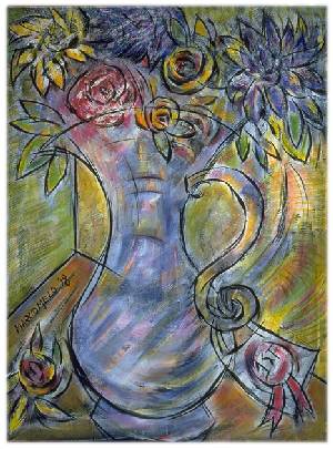
First Prize
Every fall, my friend Ted enters flowers and vegetable in a local fair competition. He brings them back adorned with gold and red tags, signifying first, second third or fourth prize. The constant sight of these vases with tags entered my mind with such force that, even though my flowers are strictly from imagination, the tags are definitely real. I thought they made an interesting element of composition, so I adopted them. The other source of inspiration was a series of paintings made in Brazil last year under the influence of my sister Joan that loves flowers, both real and painted.
The Frames
The reason I first started doing painted frames was purely economic. With the passing years I realized that they had greater aesthetic qualities, and they have become a kind of trademark for me. The frames are made with the paintings on site, taking from them elements and colours that allows me to integrate painting and frame. This process is the consequence of attempts to find harmony, rather than arbitrary choices. In fact, the opportunity to visit a painting again, after it is finished, in order to complete the frame, is a process that gives me great satisfaction. To paint the frames, I must live with the painting a while and get to know it, even analyze it, although sometimes it is the painting that makes the decision.